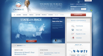

As we've been told by the NY Times Barack Obama is a Mac and Hillary a PC. In terms of their website design this is pretty clear, luckily however Obama isn't limited to 9% of the voting public. Their websites really reflect this (slightly) oversimplified view. It is cool to like Obama. Hillary is kind of square, but she's strong in her own rights, and is clearly something more aligned with what the world has been used to in the past.
I'm not really trying to point out anything substantive though. When it comes down to it, BarackObama.com makes me go "oooh ahhhh" in a way that is iPhone-esque. When I go to HillaryClinton.com I feel like I'm suddenly in a very cold place, where I won't be able to edit music, and the one cool thing about it (iTunes/Change) is stolen from the other camp, and won't work quite as well as it does in the original system.


1 comment:
On another note comparing the two websites, I find it highly ironic that with regards to policy specifics offered via their respective sites, Hillary's is shockingly lacking. For example check out the two candidate's education positions. Obama spends more time outlining what he his plans are for 0-5 year olds than Hillary does on Preschool through college. Obama offers a 15-page position paper outlining a comprehensive approach to re-tooling our education system. Hillary offers a brief history on her previous support for education and then in two pages she bullet-points her positions in such a brushed over manner that no one could possibly tell what specific plans she has. So who is lacking in detail now? Anyone who says that Obama is lacking in detail, which unfortunately, much of the MSM has bought into, obviously is too lazy to go to Bama's website. This wouldnt even demand the type of serious investigatory journalism that we used to require of reporters. This is just easy pickin's that people have become too lazy to seek out.
Post a Comment